
Ban Fun Scrubs? Maybe We’re Asking the Wrong Question.
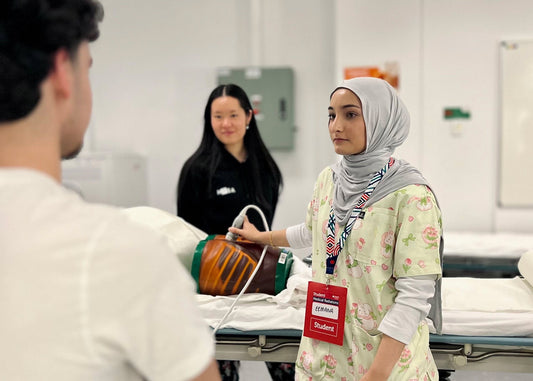
Hospitals are serious places, but they are also deeply human ones. A single nursing shift can hold anxiety, exhaustion, difficult conversations, relief, humour and small moments of connection, sometimes all within a few hours. In an environment like this, what a nurse wears might seem relatively unimportant, but uniforms are still part of the visual experience of healthcare. They influence how we present ourselves at work, how patients first see us, and even how much of our own personality we are able to carry into a profession where so much of the day is focused on other people. This is where the idea of “cute” nursing scrubs becomes more interesting. Cute scrubs are not about making healthcare less serious or replacing professionalism with something playful. At their best, they simply introduce a little colour, familiarity and personality into an environment that can otherwise feel overwhelmingly clinical.
Why Cute Scrubs Feel Different
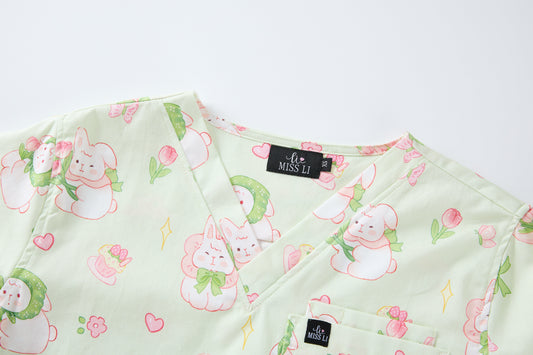
There is a reason soft colours, rounded illustrations, animals, flowers and familiar characters often feel more approachable than something stark or highly formal. Visual design affects the impressions we form, and research around healthcare uniforms has also explored how elements such as colour and appearance can influence perceptions of professionalism, confidence and approachability. That does not mean a blue scrub top will automatically calm an anxious patient, or that wearing a floral print will reduce a nurse’s stress. Human emotions are much more complicated than that, and colour psychology should not be treated as a formula. What design can do, however, is contribute to the overall feeling of an interaction. A soft blue background with tiny flowers creates a different first impression from an all black uniform, just as a playful animal print communicates something different again. None of these choices is inherently better, but they each bring a different visual tone into the clinical environment.
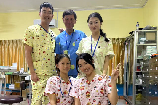
This can be especially noticeable when a print becomes part of a conversation. Anyone who has worked with patients knows that rapport does not always begin with something profound. Sometimes it starts with someone noticing your scrub top and saying, “Are those capybaras?” or a child pointing out a bunny hidden among the flowers. Suddenly there is something to talk about that has nothing to do with observations, medications or the reason they are in hospital. The scrub itself is not providing the care, the nurse is, but a familiar or playful detail can offer an easy place for an interaction to begin. In paediatric settings in particular, where children are surrounded by unfamiliar people, equipment and routines, animals, characters and colourful details can become part of the softer visual language healthcare workers already use through stickers, badge reels, toys and other small distractions. A cute uniform is not an anxiety intervention, but it can be one more way of making a very clinical space feel a little less unfamiliar.

Cute and Professional Can Exist Together
There is still a common idea that professionalism has to look a certain way: plain, dark, minimal and serious. Nursing professionalism, however, is demonstrated through clinical knowledge, judgement, communication, safety and the way we care for people. Wearing flowers or tiny animals does not change any of those things. The more relevant question is whether playful scrubs can still meet the practical and visual expectations of a clinical uniform, and that comes down to how they are designed. A printed scrub should still have a clean silhouette, thoughtful colours and a print that feels intentional rather than visually overwhelming. More importantly, it has to function as actual workwear. Nurses bend, lift, reach, walk, transfer patients, write notes and somehow accumulate an unreasonable number of pens throughout a shift. Comfortable fabric, freedom of movement, useful pockets and practical details matter just as much as the print itself.
That balance between personality and function is important because “cute” should never mean that the clinical side of the garment becomes an afterthought. There is a big difference between putting a cute illustration onto a piece of clothing and designing a nursing scrub that happens to be cute. The latter has to survive long shifts, repeated washing and constant movement while still feeling comfortable enough to wear for hours at a time. This is also why printed scrubs do not necessarily need to be loud. A softer palette, considered placement of motifs and a clean overall shape can allow a uniform to feel playful while still looking polished. Professional and personal are not opposites, and nurses should not necessarily have to remove every trace of their own style when they get dressed for work.
Colour, Prints and the Feeling of a Uniform
Colour is one of the quickest ways clothing creates an impression. Blues and greens are already deeply familiar within healthcare, particularly in surgical and clinical environments, while softer pinks and pastels can feel warmer or more playful. Rather than assigning a fixed psychological meaning to each shade, it is more useful to think about colour as part of the emotional language of a design. A pale blue floral print may feel airy and gentle, a sage green can bring a more grounded, nature inspired feeling, and pink can make the same silhouette feel completely different. Individual and cultural responses to colour vary, so there is no single “best” scrub colour for patient comfort or nurse wellbeing. What matters more is how colour, print, fit and the overall design work together.
Prints add another layer because they give the eye something recognisable to engage with. Animals, flowers, food and small illustrated characters can bring a sense of familiarity into an environment dominated by clinical equipment and neutral surfaces. They can also allow nurses to express something about themselves without changing the professional role they are there to perform. One nurse may feel most like herself in navy, another in florals, and another may genuinely prefer tiny strawberry eating capybaras. All of those people can still be equally capable nurses. When so much of nursing involves adapting to the needs of patients, families and the wider clinical team, having even a small amount of choice in how you present yourself can feel meaningful.

The Nurse Wearing the Scrubs Matters Too
Discussions about healthcare uniforms often focus on what patients think when they see them, but there is another person experiencing that uniform for eight, ten or twelve hours at a time: the nurse wearing it. Nursing requires constant emotional and cognitive switching. Within the same shift, a nurse may reassure an anxious family, administer medications, answer call bells, document care, help a colleague, manage competing priorities and respond to an unexpected deterioration. Scrubs obviously cannot make any of those demands disappear, and it would be unrealistic to suggest that a cheerful print could somehow solve workplace stress. Clothing can, however, still be a form of self expression and something that makes getting ready for work feel a little more like yourself.
That idea is particularly important to Miss Li Scrubs because the brand comes from a nurse’s perspective. I know what it is like to spend long hours in scrubs and how quickly a uniform can become something you simply put on, work in and take off again. I also never felt that being clinically capable and enjoying softer, more playful things were contradictory. Nurses can handle serious situations and still love flowers, bunnies or a beautiful colour. We can be professional without dressing as though personality has no place in healthcare. That is really where the idea behind Miss Li comes from: not trying to make nursing prettier or pretending that a cute scrub can fix a difficult shift, but creating uniforms that acknowledge that the person underneath them is still a person.
A Little More Humanity in a Clinical Space
Perhaps the psychology of cute in nursing scrubs is less about proving that a particular colour or print produces a particular psychological outcome and more about recognising how small visual details contribute to the feeling of human interactions. Colour can shape first impressions, prints can create familiarity, clothing can express personality, and sometimes a little bunny on a scrub top simply gives two strangers an easier place to start a conversation. None of that replaces good nursing, and it should never be presented as though it does. It is simply another layer around the care itself.
Healthcare will always contain serious moments, and our uniforms do not need to pretend otherwise. But seriousness and softness are not mutually exclusive. There is still room in nursing for colour, personality, warmth and small moments of joy. Cute scrubs do not make nursing less professional. When they are thoughtfully designed, they simply allow a little more of the person wearing them to come through.